Friday, April 27, 2012

Instant Living Room

Unfortunately for us, Grand Cayman does not have big box furniture stores.  (I guess for the wallet you could say fortunately!)  I am constantly looking at websites of Crate and Barrel, Pottery Barn, West Elm, etc. to see their new arrivals.  It gives me inspiration, as well as showing what the trends are.  Luckily for many of my clients, several of these stores now offer international shipping to the Cayman Islands. 


While checking out Crate and Barrel's new arrivals, I came across this good looking slipcover chair.  Such a cute print.  This is how you can do a floral, but still have it masculine and sophisticated. With its white background and blue flowers, it remains light and airy at the same time.  


Using the Cortland Chair as my inspiration, here is how you get an instant Living Room: 

1. 2.

Beside the slipcover chair, I would have this wood carved accent table with the glass jug lamp.  It will instantly create a cozy spot for your coffee and a book.


The rest of the Living Room looks like this:

1. 2. 3. 4. 5. 6. 7. 8. 9. 10.


The rest of the room is drawing inspiration from the blue and brown in the chair.   For the walls, Benjamin Moore's Mt. Rainer, it is a very soft gray-blue.  

It is important for any home to have a successful balance of feminine and masculine, soft and hard.  The sofa lines could be considered more feminine, but the color is more masculine, as well as, neutral. 

 The rug has a beautiful pattern almost Art Nouveau, but wouldn't be considered busy for the man in your life.  It mixes the browns and blues perfectly, plus creating a soft wool for underneath your feet.  

The coffee table brings in the hardness (and it's on sale at Crate and Barrel!)  It mixes in a bit of modernity to the room to keep it from getting too fussy.

For the side tables flanking the sofa, we have graceful metal base with mirrored tops.  Bringing in the masculinity on top with the amazing Moroccan lamps.  

The plantation chair brings in another element of "nature" and texture, which every room requires.  This chair could either sit beside the sofa or fill a corner.

  Then we have plenty of options for throw pillows.  Mixing and matching solids and pattern for the sofa and the plantation chair.  A solid lumbar pillow could also go in the Cortland chair.  I love the solid pillow from Pottery Barn with its' jute trim and the  pillows handmade from rugs are amazing!  (Feel free to give to me at Christmas.)


Hopefully you enjoyed my instant living room.  Please don't rub in my face the amazing things you have seen lately at West Elm or any other chain furniture store.  


PS When we move back to the States, I am going to be hitting up West Elm and Z Gallerie.  I have never purchased from these stores, but love what I'm seeing online!!


Tuesday, April 24, 2012

Design Dilemma #2: Curtains


I already stated here about the necessity of curtains.  They are one of my top elements for creating a Southern style room.  But, many clients seem to want to skimp on curtains.   Why oh why would you do that.  If you were to look at all the beautiful images you have saved from magazines and Pinterest, I would imagine every single image has curtains in them.  Yes, they can cost a lot of money because of the amount of fabric you need and the labor.  But you aren’t going to be changing them out for many years to come. (This is what you have to tell  your husband when he looks at the estimate!!) 

There is always the option of buying inexpensive ready-made curtains from Target.  We will need to add lining and add contrasting fabric on the ends to make them long enough.  These are tricks to turn inexpensive into gorgeous.  I'll show you some images of how you can do this.

Wait, what’s that you say you can sew and you aren’t scared of making your own curtains??  Hang on one second while I fly to your house and bring you fabric to make me some!  If you know anyone that you trust enough to make you curtains have at it!  But don’t skimp on them, curtains add softness and are the finishing touch to any room. 


Continuing with my theme of quick and simple fixes to add a designer stamp of approval, we are moving on to window treatments!  I am only going to be discussing window panels.  This is where I notice the most issues.  While I feel Phoebe Howard perfects all things curtain, I am going to branch out and not include any of her work.  You should look at them anyways to see perfection. 


Don't let your curtains hang inches above the floor.

The worst mistake you can make is hanging your curtain panels too short.  There is much debate on the perfect length for your drapes.  Several designers go with the ½” above the floor.  Others go to exactly touching your floor.  I think a good rule of thumb is to touch your floor or add up to 3”.  This allows for slight puddling that you can lift and plop the curtains where you want them to go.  However, if you have multiple pets in the house and have hardwood floors, stick to touching the floor or 1”.  Curtains can be quite the pet hair collectors.  (Having your curtains rest on the window sill is not an option, except for at a kitchen sink. )  


(source
Do: Curtains are hung directly below molding and are grazing the floor. (Crazy kooky room isn't it?)


Do: Look at that pretty lilac fabric on the curtains!  These curtains are puddling a few inches on the ground.


Don't: hang your window treatment on the molding!

The next mistake is hanging your curtains directly above the window.  The point of curtains is to frame out your window, and to elongate and widen your room.  This cannot be accomplished if they are hung an inch above your window.  Place your rod directly below your crown molding or ceiling. 


(source
Do: Elevate your room by placing curtains all the way to the ceiling. 


 (source)
 Don't: cover your whole window with the curtains and don't place the curtains directly above the window.

While we are discussing rod placement, consider getting a rod 2 feet wider than your window.  This allows for the curtains to actually frame your window.  The panels should touch right where the glass starts.  You want your curtains to make your windows look larger.  Adding a foot to either side of the window should allow for this.  Rods can get expensive if you are using something solid.  Consider using plumbing fixtures from your local hardware store and piecing them together.  

Do: make your curtains begin at the window's molding and place them at the ceiling.


(source)
Don't: make your curtains only one width wide.  Extending your rod allows room for fullness in the panels.

Skimpy window panels can make a window look so sad.  You want the fullness of your panels to be 2 times the width of the window.  This is where draperies get to be expensive.  If you are using a $45 a yard fabric you would need 7 yards of fabric for a standard 48” window hung at 9’.  With this being said, don’t fall in love with a fabric at that price, find one for $20 or even less!! 


(source)
Do: This famous image of a Windsor Smith room created quite a stir.  The silk curtains have crazy fullness, at least 3x I would say.


Below are some examples of inspirational curtain styles you can do with store bought panels.  You could also do this with simple cotton fabric you can buy for $8 a yard. 


Sew together two solid fabrics into stripes or chevron stripes.  The light fabric can be a simple drop cloth.


(source)
This living room creates a coastal themed curtain wall by using three solid fabrics one width wide. 


How about buying simple linen panels and punching it up with a 4" banding of your favorite color?


(source)
These beautiful silk curtains have been accented with a wide greek key border. 


Curtains too short?  No problem just add length with an accent color and why not incorporate your favorite color purple as a thin tape?  Tan on the bottom also will hide dirt!

 (source)
Another pair of beautiful curtains this time with tassel trim around the whole perimeter.  I want that wallpaper!

 (source)
Beautiful coral drapes with subtle puddling.  I can't make out exactly what the trim is on the side but it is a nice detail to add more texture.

 (source)
Nice linen panels with more banding, this type creates a more modern interpretation with repeating it 4 times.


 (source)
How about spacing out your banding to create contemporary stripes.  Will someone buy me a zebra skin?


(source)
Such a pretty room.  More banding along the edge.


(source)
How about putting a stencil on it?  Or you can block print it, but make sure you practice plenty of times before.


In conclusion, please add some curtains.  In the words of Phoebe Howard, my favorite decorator, a room without curtains is like a face with no eyebrows!  Perhaps you have been putting it off for a long time due to cost, well today is the day.  Measure the height of what you need and head out to Target, West Elm, World Market, etc and pick up some ready made drapes.  Then you can go to your local fabric store and pick up a pretty greek key trim to add to the length of your drapes. Instant custom drapes have now been created!


If you want a more summed up version of what I am talking about, I found this article on Elle Decor. 

Friday, April 20, 2012

Outdoor Furniture- Deal of the day!


Check out this super cute furniture collection from Target.  The top set is $450.  What a great price for seating for four and a coffee table.   I'm sure you have been longing to bring some sunshine to your patio.   And don't forget you can get the little bistro set for your front porch for $199.  Come on!  How cute?!!

As the weather has been getting warmer, hopefully you have been spending more time outside.  What better way to enjoy the outside than the cute set from Target?  

Taking the cues from these cute sets, let's create a little homey seating area.  I think blue really pops with the yellow.  I'm going to work with yellow and blue. 


First let's anchor the space with an indoor/outdoor rug:
1. 2

Indoor/Outdoor rugs are made of polypropylene, which is a type of plastic.  These rugs can be hosed off, scrubbed, and left to air dry over your railings.  Perfect for high traffic indoor use, or messy kids and pets.


1. 2. 3. 4. 5. 6

Check out all these fun throw pillows.  Mix and match solids with pattern on your lounge seating and throw some lumbers on your dining chairs for extra comfort for long dinners with friends.  Several of them are from Etsy.com so support homemade.  

Hopefully this patio set inspired you to eat your lunch outside and enjoy the warming weather.  Spruce up your patio to make it an extension of your home.   Have fun with your outdoor space and make it a happy area.

Tuesday, April 17, 2012

Design Dilemma #1: Artwork

As an interior designer, it is my job to make your home look good.  Many people have the impression that they can not hire a designer because we cost you tens of thousands of dollars.  While that can be the case, often times my job consists of fluffing and rearranging what you currently own.  Clients realize something is askew in their room or are wanting a change.  Hire a designer for an hour consultation and watch the magic.  You are under no obligation to continue using them or implement their ideas.  Sometimes just having a fresh pair of eyes in your space is a wonderful idea.  


I'm going to start a little series of things I notice when I go into homes that would be simple and quick fixes to put a designer's stamp of approval on your room.  It really is a list of my decorating "pet peeves", but that sounds negative.  I will give you the "dos" after I discuss the "do nots," I am here to help after all...


First on my list is artwork.  I love artwork... I think people get a bit intimidated about art.  Don't be scared of it.  If you are really drawn to a piece of art or it says something to you, Buy it. Obviously it should relate to your home, but you can always make it work by tying in the colors with accessories and other items in your home.  


One of the biggest errors as far as art work goes that I have seen is that it is hung too high.  I believe this is because typically the wife has the husband hang the art.  


No, no little pieces of artwork come closer to the sofa and talk to him!


While the internet gives varying heights as to where the artwork should be, the general consensus is the center of the piece should be at eye level.  This is typically 57"-60" from above the ground.  Keep in mind this is the center of the painting, not the top of the frame or the bottom of it.  


In the images above, not only are the pieces crazy high, they are not relating to the pieces of furniture below them.  A rule of thumb if you are hanging art above your sofa, it will be about 10" above it.  This allows you to rest your head back and not get knocked out.  


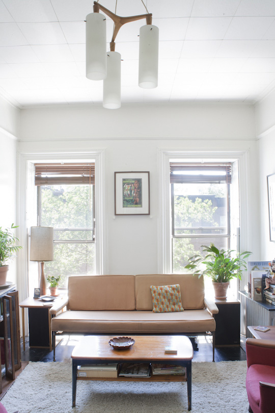
This image of a Hickory Chair Furniture seating arrangement shows that the center of the artwork grouping is hung at eye level.  


When it comes to hanging art above tables, consoles etc. the same rule of thumb applies.  They should hang about 10" above the surface.  There will be cases when this will not be the right height.  For instance above a desk, you may want it lower to allow you to view it while you are working.  


This artwork is hung proportionately to the console beneath, as well as, hung at proper height.


You want your artwork above your pieces of furniture to not only relate to it spatially, but also in proportion.   Your artwork should be 2/3 the size of the furniture's width.  The image above is a good example of this rule of thumb.  

If you are going to create a collection of images, they should also relate together.  Keep them a few inches apart.  The distance will vary due to the size of the artwork.  Typically 4" is a good distance. 

Artwork relates to the sofa in proportion and distance to the bottom.  The pieces are also hung at a nice distance from each other.  Plus they are really cool!


There are plenty of websites showing you how-to hang your art.  Better Homes & Garden had inspirational ideas for working with your blank walls.  Or you can try SAS Interiors.  Here's a little video.  The general gist of hanging art is to create a template of what you are wanting to hang by laying them out on the floor, then tape up the template on your wall before you put nail holes on your wall (I am definitely guilty of having Swiss cheese walls!). 

I'm not sure how I feel about gallery walls.  I love them, but then I also get so overwhelmed by them.  I think it is very important to surround yourself with things you love, but I also am a big proponent of symmetry.  Gallery walls sometimes drive me insane. The key is to keep them close together and have similarities.  Either in subject matter or frames.  

Style at Home has an article about gallery walls.  Here are their steps to create balance in your collection.  

1. Place the largest piece in the center.
2. Evenly space the works with the darkest subject matter.
3. Use a cohesive palette.
4. Before hanging, arrange your pictures on the floor and move them around until you have a combination you like. 
5. Then hang the pieces, judging the placement by eye and replicating the arrangement as closely as possible.


 I can not handle these two images.  I would be way to afraid to stand in these rooms for fear of falling pictures.  The first image probably drives me more crazy because of the sofa pattern + the lamp + all the art.  The hallway image has consistent black frames, but the art should not go floor to ceiling.  You lose the importance of each image when it is so much in your face.  Given the fact that you only have a 3' viewing space in the corridor, the amount of art should be limited.  


I don't mind these gallery walls because they have symmetry and shape.  

Black and white keeps it unified, as well as, the rectangle shape.  This is a gallery wall I can handle.


Just the right amount of images and I like the diamond shape of the collection.


Unfortunately the art doesn't look centered above the headboard.  And I would like for it to go up a few inches, but there doesn't seem to be space.  But I can handle this gallery wall due to the matching gold frames, color palate, and shape.


 (source)
So much impact with repeating shape and color.


Matching frames and rectangular shape.


This gallery wall is starting to go a little on the crazy side for me.  I think the white frames help keep it more airy than the hallway gallery.  


Take a look at your artwork.  Do you think it is hung higher than most eye levels?  Does it relate to your pieces of furniture beneath it?  Are they too spread out?  

What about gallery walls?  Are you a fan or are you a bit timid like me?

Don't forget to consider hiring an interior designer to give you a fresh perspective on your space.  Many furniture stores offer hourly consultations for their customers.  


Saturday, April 14, 2012

Violet, You're turning violet!

Purple is my favorite color.  I have taken a picture of all the purple items I have in my closet.  And keep in mind, I only have summer clothes here on the Island.  It doesn't include all my purple sweaters and long sleeved shirts.  As I am typing this, I am wearing a purple shirt, purple earrings, and drinking out of my purple Nalgene.  


My purple wardrobe, including four purple bathing suits... a bit excessive I know!


While I love purple, I don't seem to decorate with it.  My own home in Charleston was greens, creams, and blues.  I did manage to throw in a blue/purple/gray guest bathroom (Daydream by Sherwin Williams).  Next time I am able to decorate, I am going to throw in some purple.  


Like all colors, purple has quite the range in the decorating scheme.  You can go for a soft lilac (my favorite) to a deep aubergine.  (Don't you feel so fancy when you say aubergine?)  Purple mixed with gray makes it more masculine, while when it is mixed with red it becomes softer more feminine, or it can sometimes go "kiddy."  


Why is it that so many people have an aversion to purple?  Everybody likes blue and red right?  (Well not me, I do not like red.)  But when you mix them together it creates such a pretty color.  I have found that men especially have an aversion to purple. Perhaps they imagine Barney the dinosaur when they think of purple, or they think it is too feminine.  I am including a few rooms to show that purple can look masculine.  Luckily Steven enjoys wearing purple so hopefully he will like it in our house.


Purple was one of the "hot" colors last year.  While I would never tell someone to decorate with the trendy items and color of the year (by the way, this year Pantone's color of the year is Tangerine), I do think it is important to decorate your house with colors you like and make you happy.  If you are struggling with color in your home, get inspiration from your closet.  If you only have blue shirts in your closet, you need to decorate your home with blue.  


I digress... back to my original topic, Purple.  Here are some great rooms with purple.  


Such a pretty dining room featured on House Beautiful's cover.  If only I could be as bold to paint my doors a rich glossy indigo!! (source)


This room was featured in a showhouse in SoHo inspired by the movie Girl with the Pearl Earring.  John Saladino, the designer, was able to mix purple with many natural textures in the room- leather, nail heads, rattan, chenille, wood, and stone.  The purple hues look very elegant and contrast nicely against the neutral backdrop. (source)


This is using purple in a feminine way with lilac paint and lilac fabric.  To make it work for your husband, keep the purple fabric but use a richer color on the walls and a more structured window covering.  It does, however, make a pretty guest room.  (source)


House Beautiful made sure to let you know that this is a "hockey dude's home."  They gave him a super comfy looking mohair purple sectional.  Adding the rustic coffee table and grass cloth walls brings in texture and masculinity.  (source) 


While I love purple, I don't think I could commit to purple floors!  I could do the pretty purple napkins and the paint. (source)


This is an intriguing room, don't you think?  There are so many different styles, textures, and colors incorporated.  It has a masculine feel, but also uses pinks and purples.  I really like the gray purple velvet on the sofas that ties in with the curtains.  (source)


Look at this pretty bedroom from Crate and Barrel!  The bedding is gorgeous, the upholstered bed is perfect, the art is great, and the walls are a subtle smoky lilac.


Don't forget to add a splash of Purple outdoors.  Isn't this a fun collection from Crate and Barrel?!  


Here are some ways you can add Purple to your home: 


These are the shades of purples I can handle for wall paint.  If you aren't brave enough to paint a whole wall, why not paint inside a closet or the inside of a cabinet?


1. 2. 3.

Seriously who knew Target had wallpaper?  These are all absolutely wonderful wallpapers.  They are bold prints so think small, like an entry way, powder room, or an accent wall in a bedroom?  You could always do a half wall and put up a chair rail and paint the bottom white.


1. 2. 3.

If anyone has a spare $6000+  buy me the Aquasilks rug.  I love their collections so much at ABC Home.  You would be the coolest kid on the block with that rug.  However, for $1000 you can get the same size rug from Surya and they are pretty great options too. The tie-dye rug would be fun in a playroom.


1. 2. 3.

You can spruce up your sofa with a pretty purple throw or these great block printed pillows.


1. 2. 3. 4. (I used this fabric in a little girls' nursery), 5.

If you want to make your own pillows or have curtains made, the above fabrics are pretty great.  It just takes a little bit to really liven up your space with pretty purple!


1. 2. 3. 4.

I love these pieces of artwork so much.  They could work in any space.  Or how about flanking your sofa with two pretty purple lamps?  I would! 


1. 2. 3. 4.

The least expensive way to add your touch of purple would be to go the accessory route.  Pick up some amethyst glass at the flea market, or pick some lavender or hydrangeas, buy a purple picture frame, or how about adding splashes of purple in your bookshelves?


1. 2. 3. 4.

Don't forget about your dining table.  Wouldn't these items be like little jewels on the table?  And just look at the Le Creuset tableware!


All these items have reaffirmed my love for purple.  Hopefully it has started a spark in you for your own home.  If it has, I would love to be able to help create a wonderful space for you to call home.